Taura Crossfit
Estratégia. Identidade Verbal. Identidade Visual
Date: 2023
Taura is a southern Brazilian crossfit gym that was created and inspired by the idea that crossfit goes far beyond physical exercise, but rather unites people around acceptance and the building of mind and body. In the regional dialect, Taura means to be brave, strong, and fearless. It is a term that is inviting to the public but does not necessarily invoke a sense of unity or motivation for members. Thus it no longer represents the brand’s current purpose.
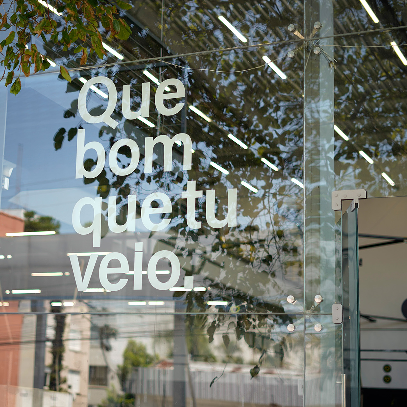
The project’s objective was to convey greater closeness and inclusivity, making the brand more friendly, contemporary, and organized for the beginning of the group’s expansion process, which will now also operate under the franchise model.
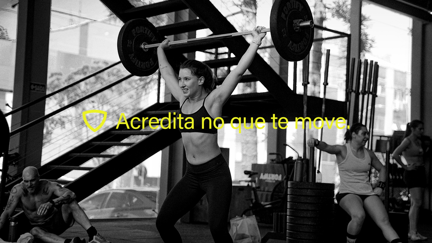
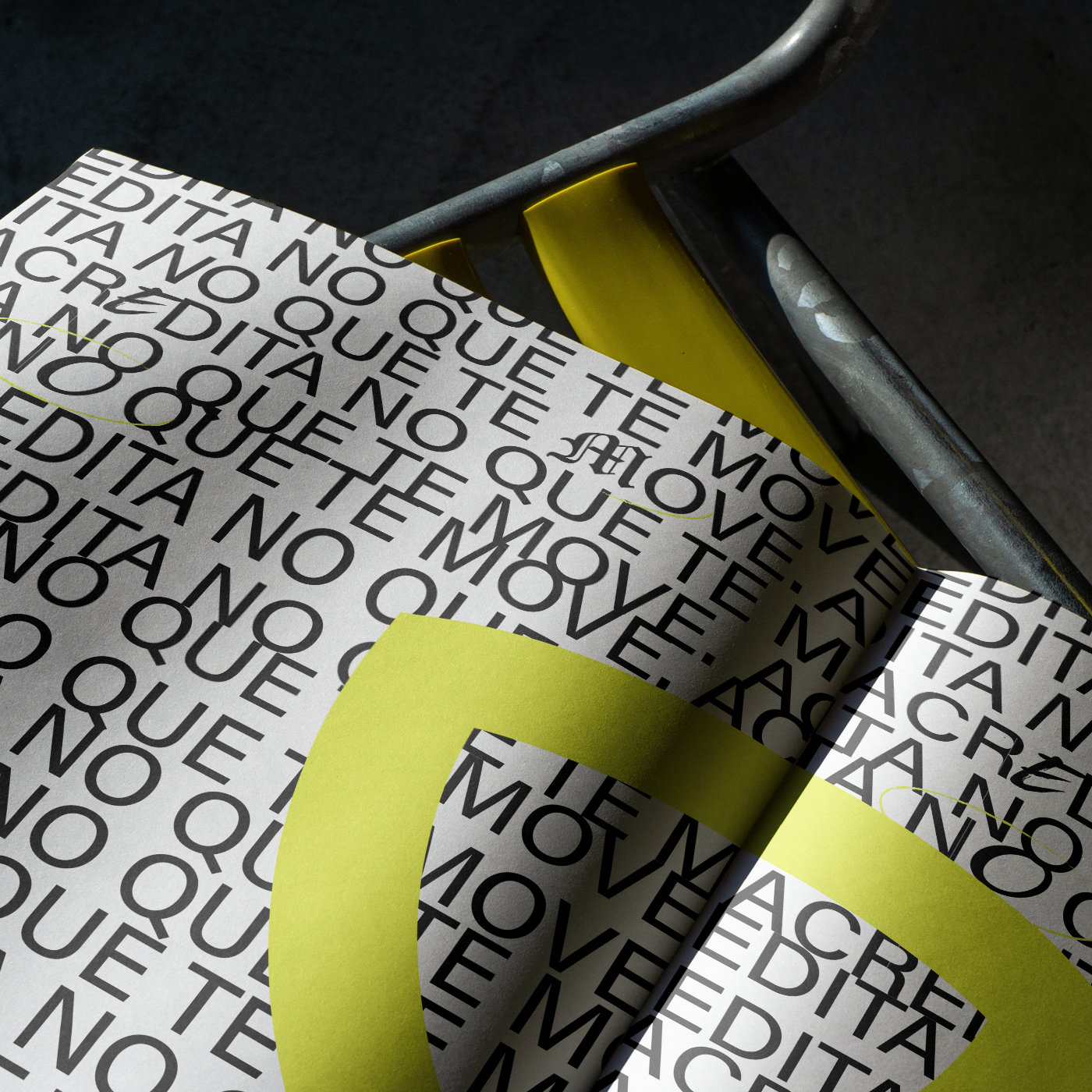
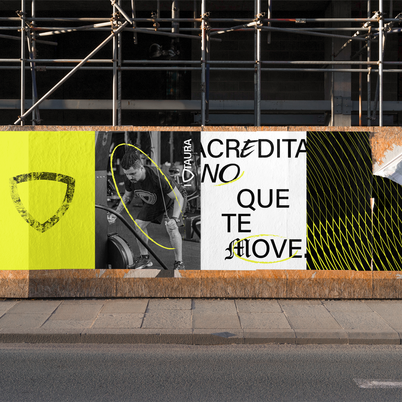
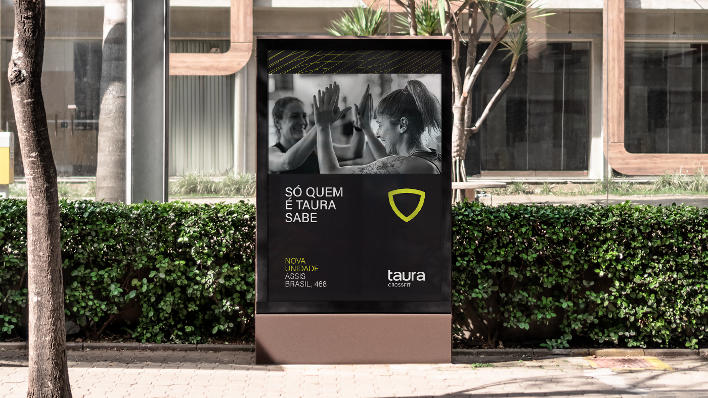
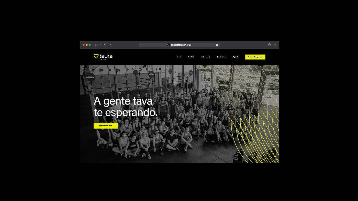
During the process, we discovered that being a member of Taura is a status that people want. Our strategy consisted of elevating people to protagonists, emphasizing their qualities, personalities, and the transformative power of unity. Who can speak better for your brand than your own customers? We turned this truth into a verbal identity that speaks directly to each athlete, resulting in a tagline that inspires and drives: Believe in what moves you.
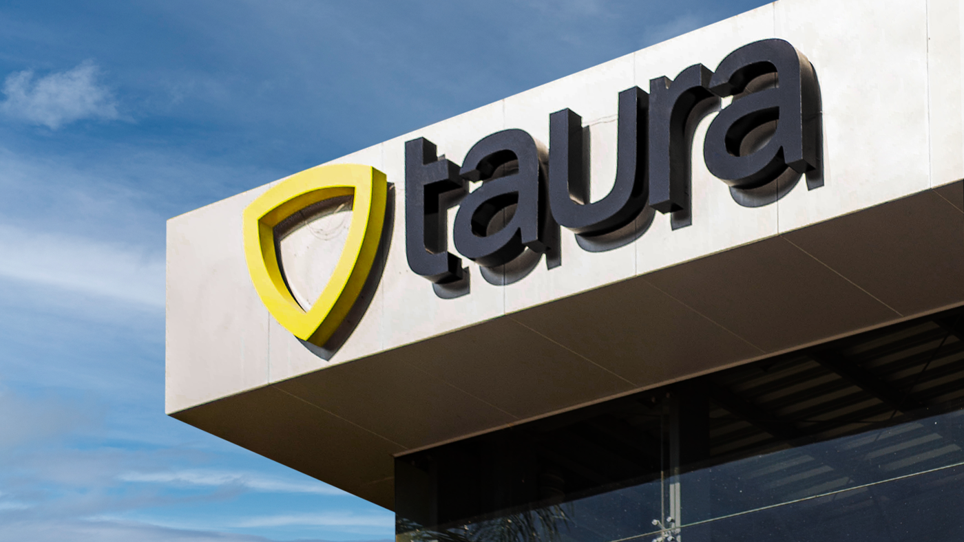
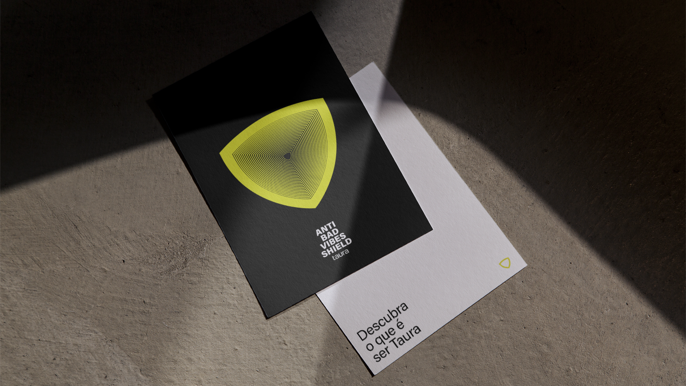
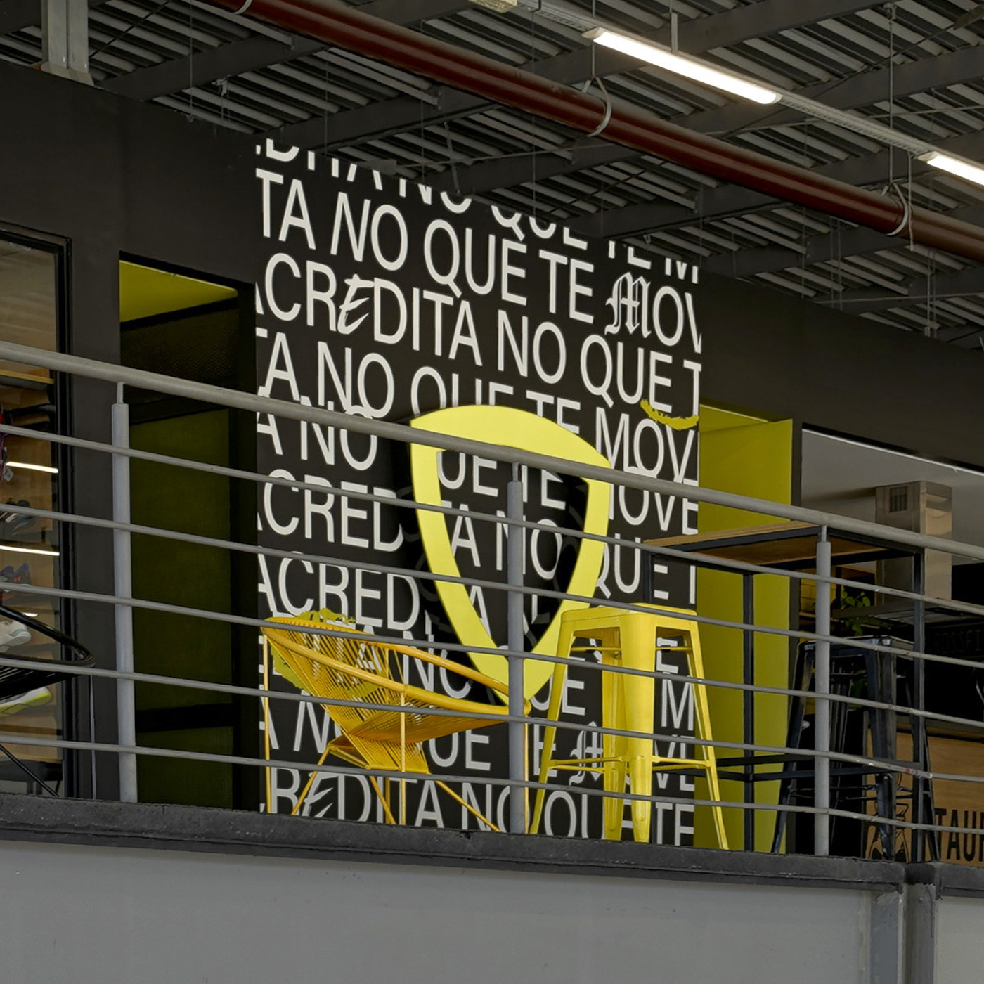
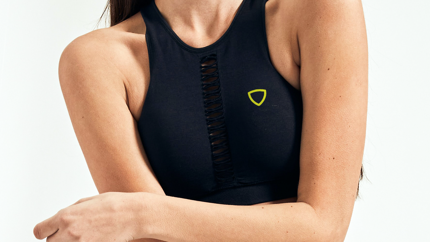
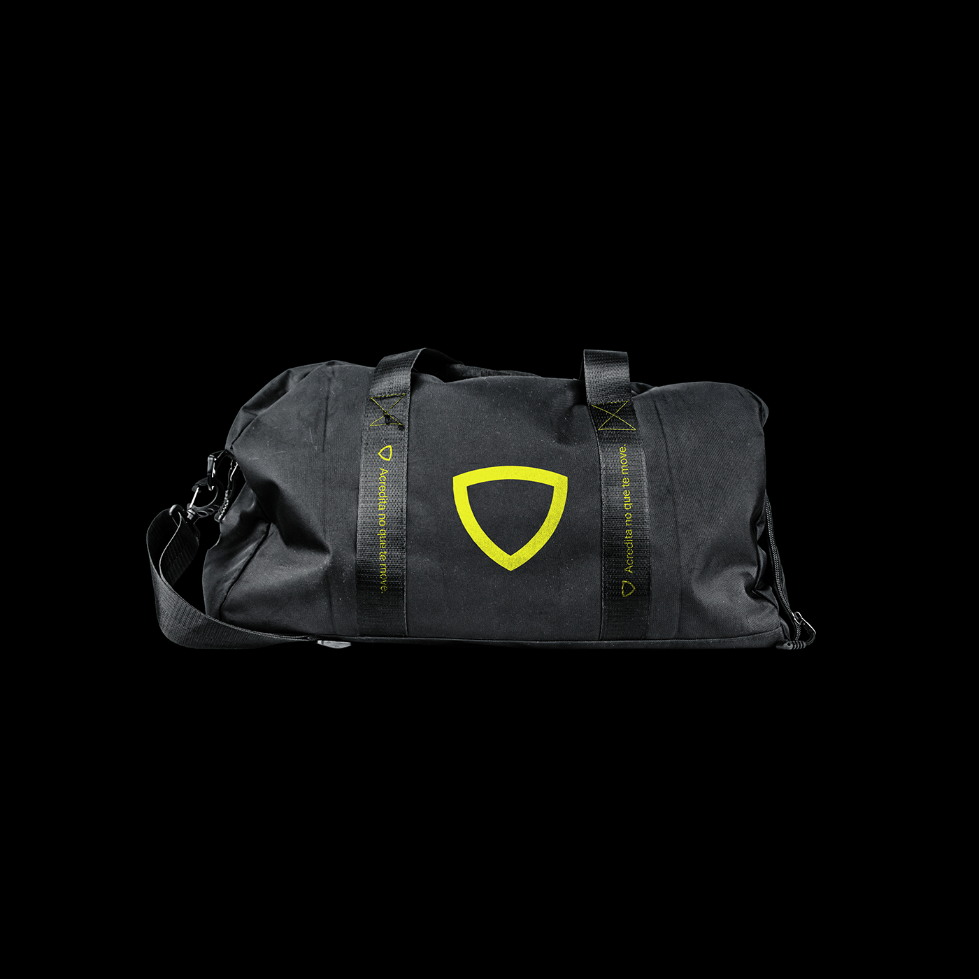
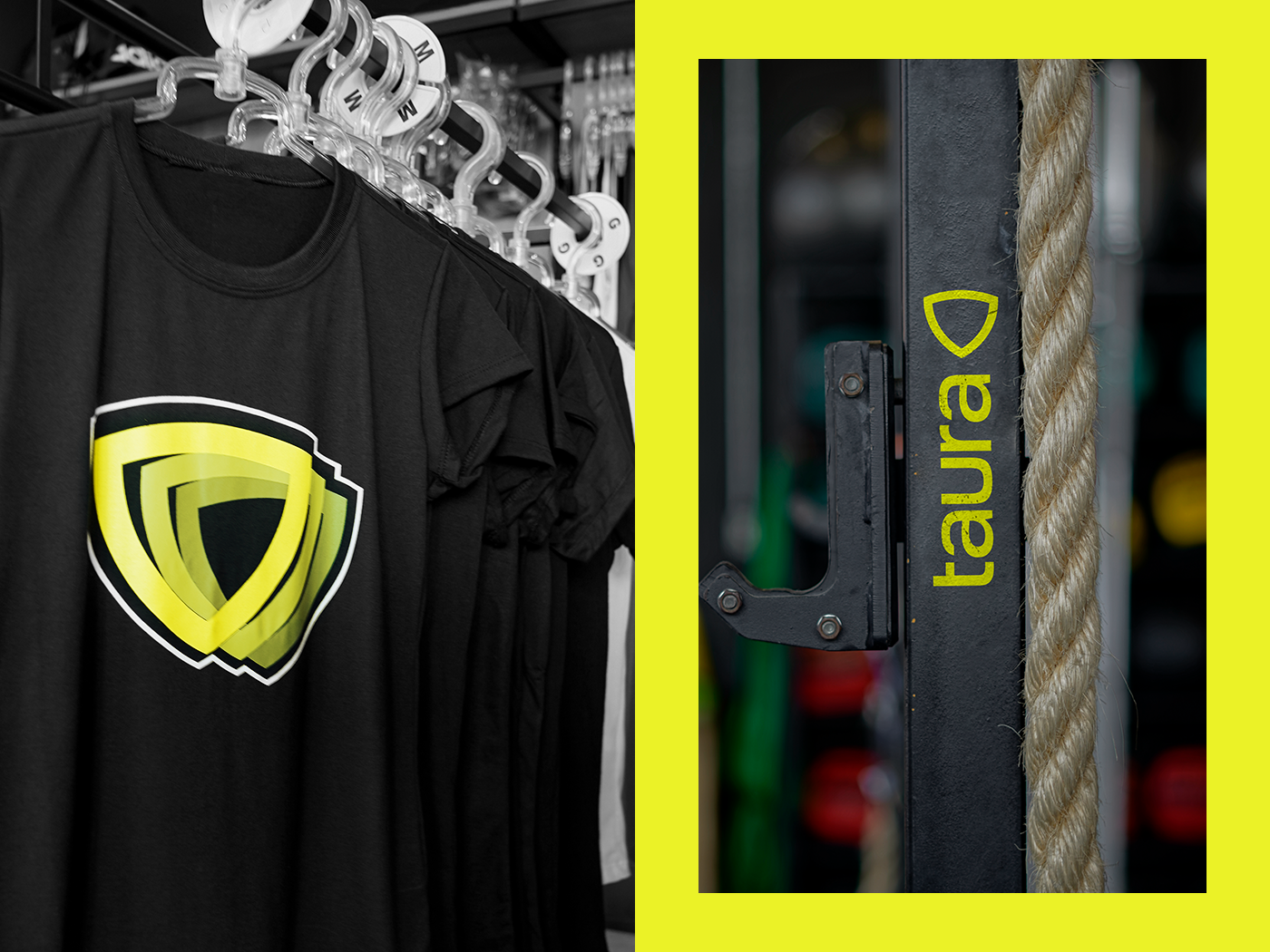
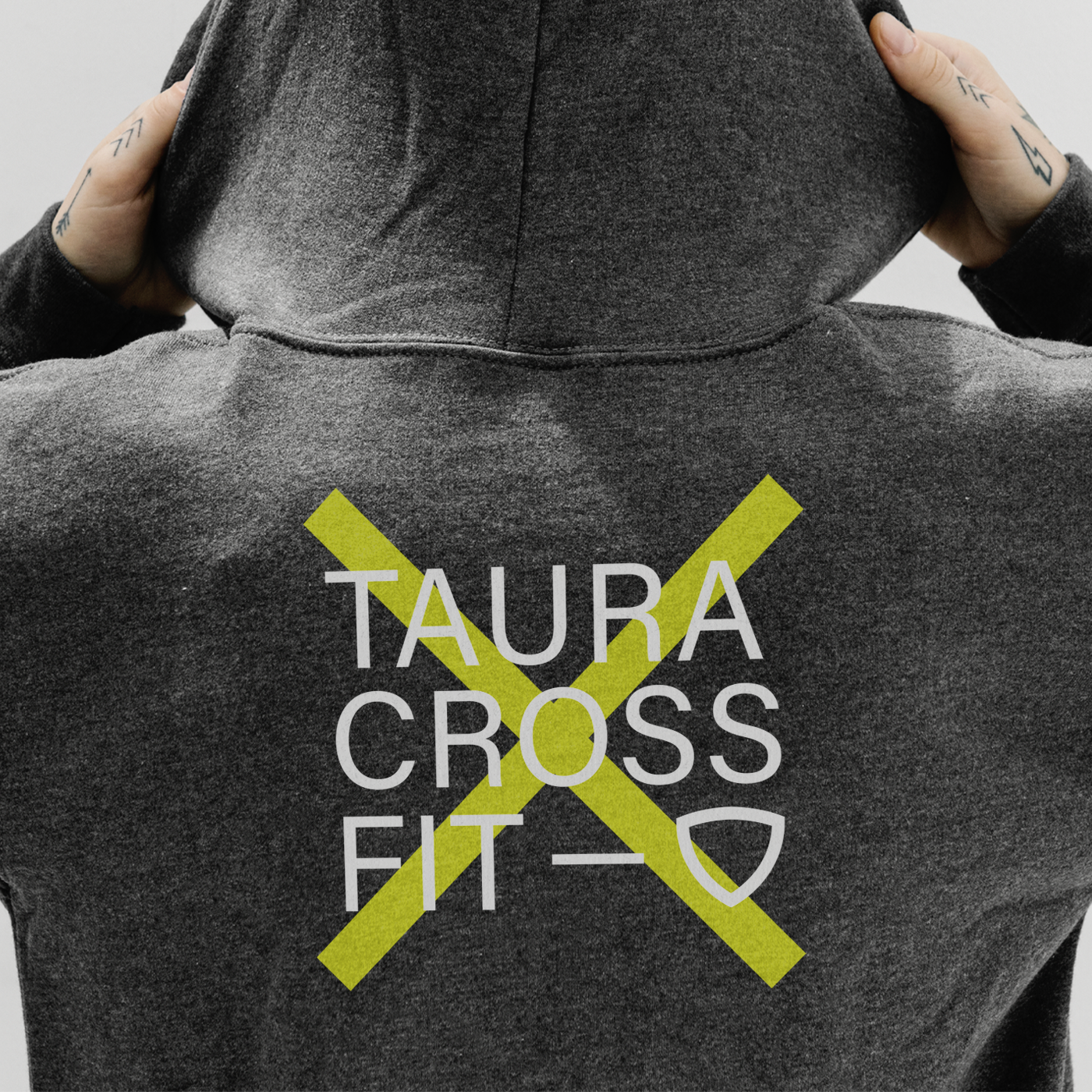
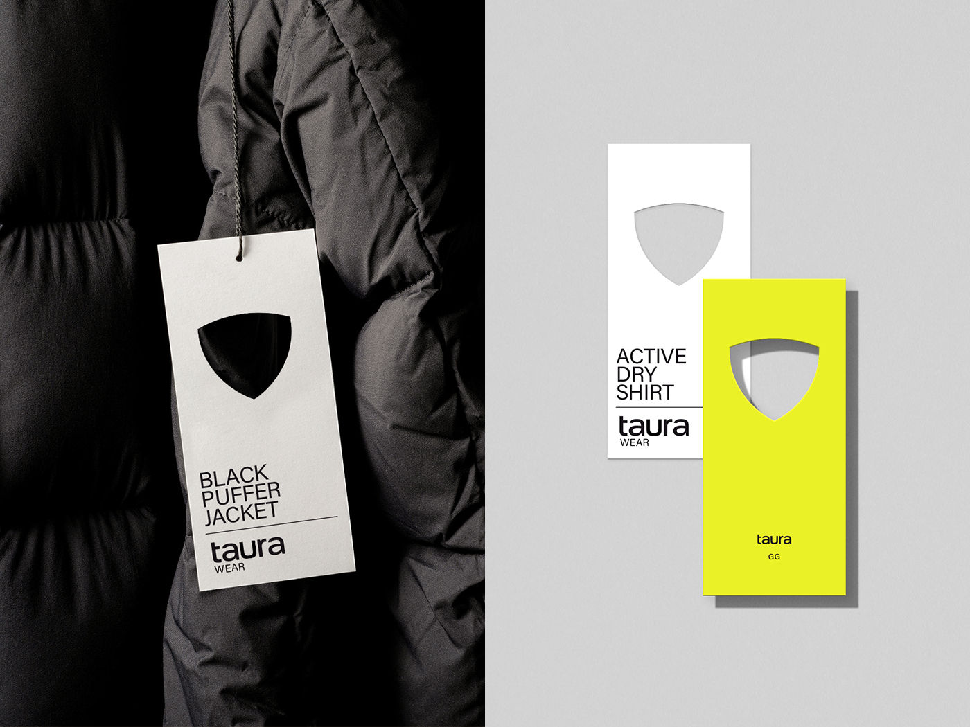
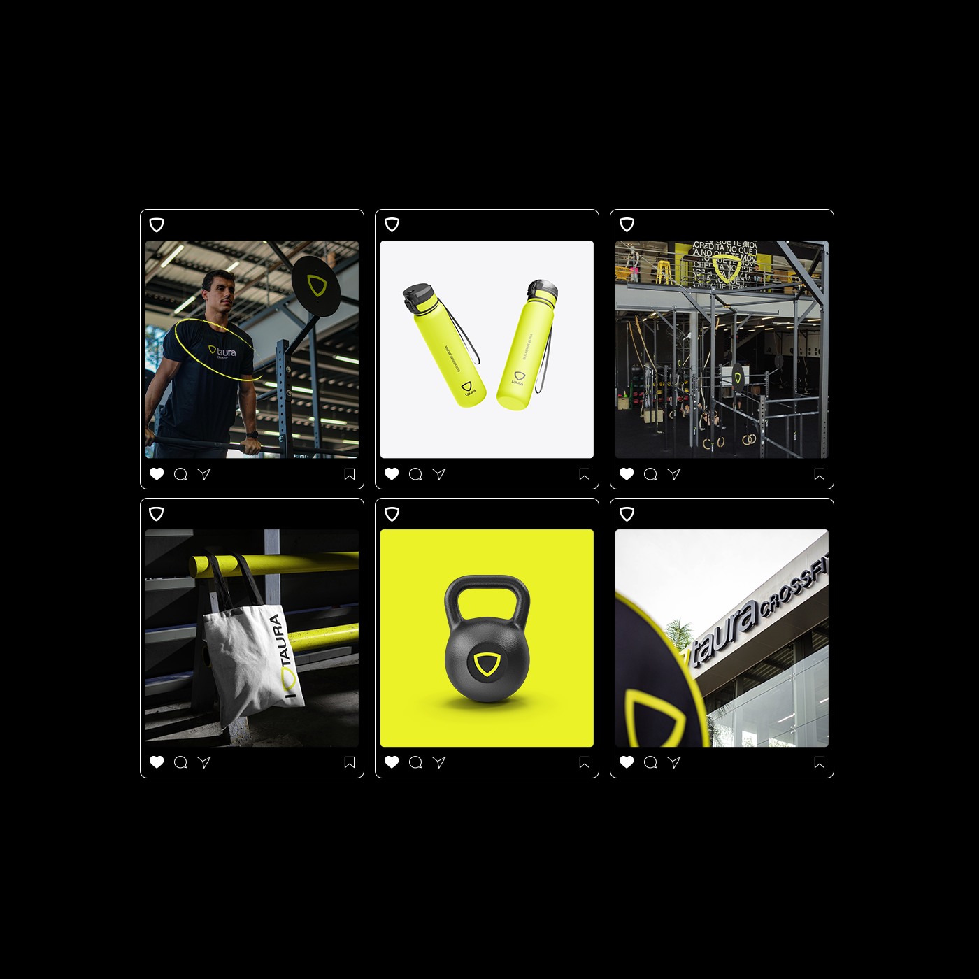
The result is a vibrant, agile, modern platform that has been adapted to the demands of a rapidly growing brand. The shield symbolizes the strength and cohesion of the group associated with a practical and modern typography that makes crossfit achievable to everyone. The new color tone aims to be more vibrant and engaging, and the headquarters’ ambiance adds functionality and contemporaneity to the brand’s image.
Taura, believe in what moves you.