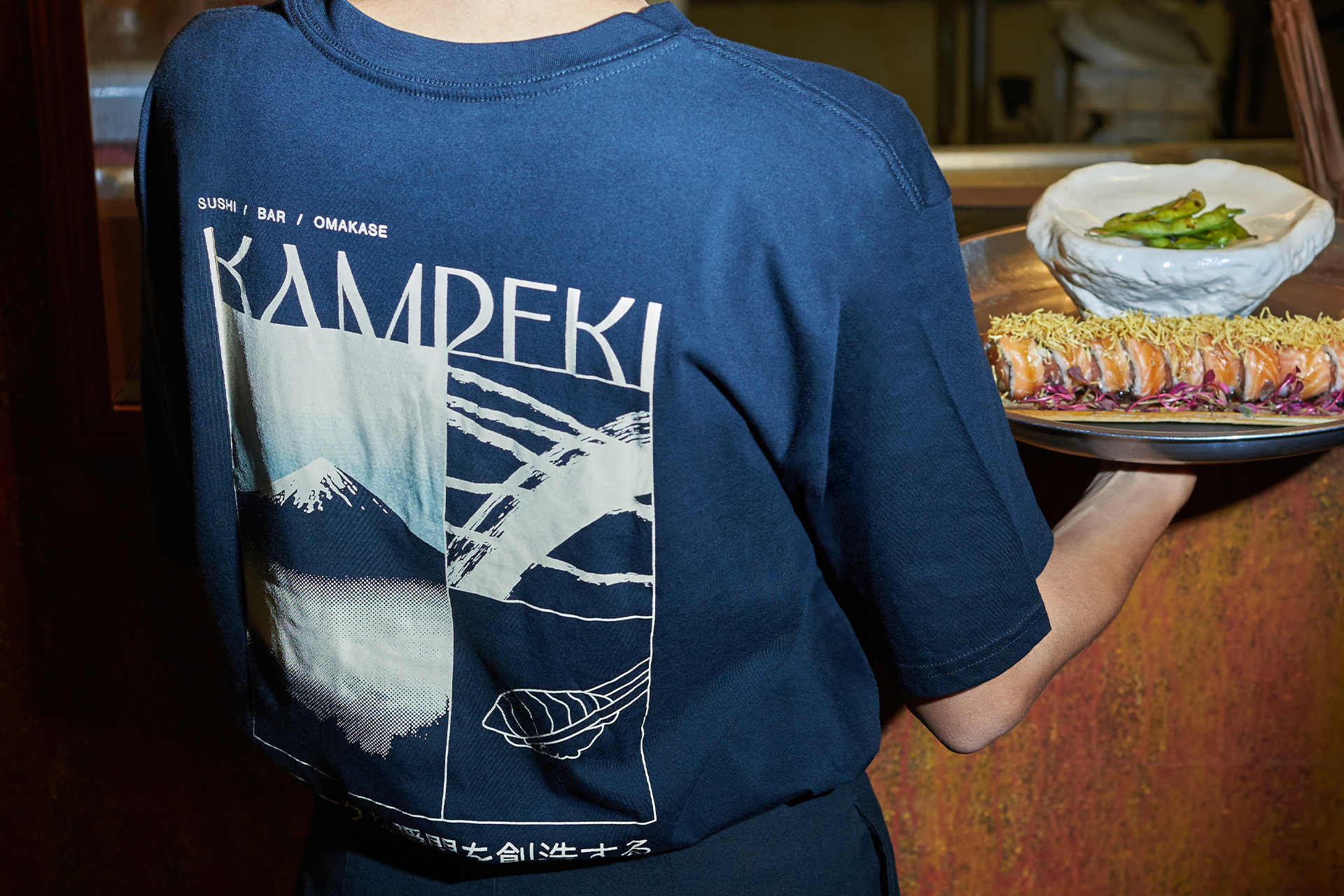
Kampeki Sushi
Branding isn’t about changing what works. It’s about making the experience unforgettable.
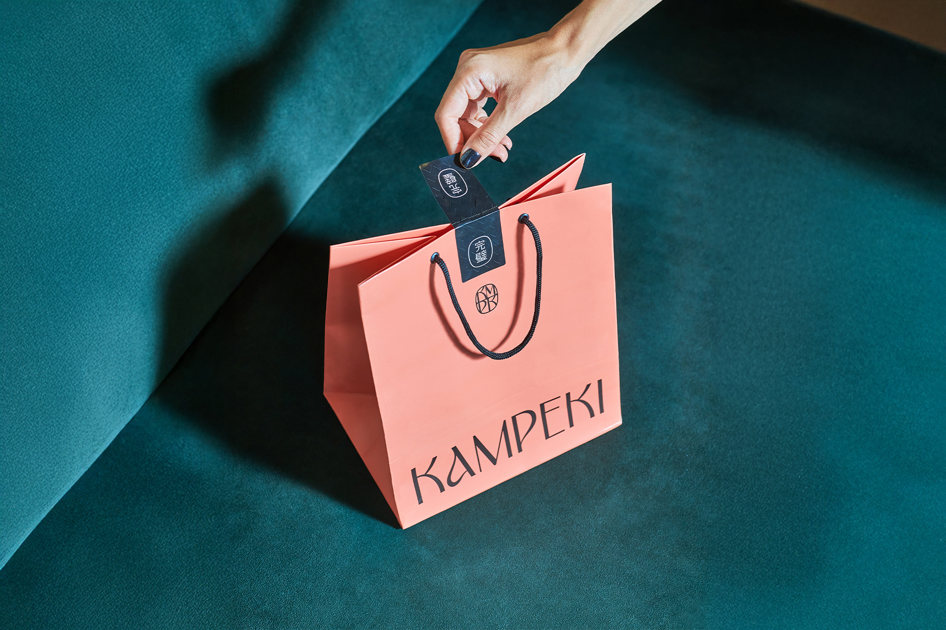
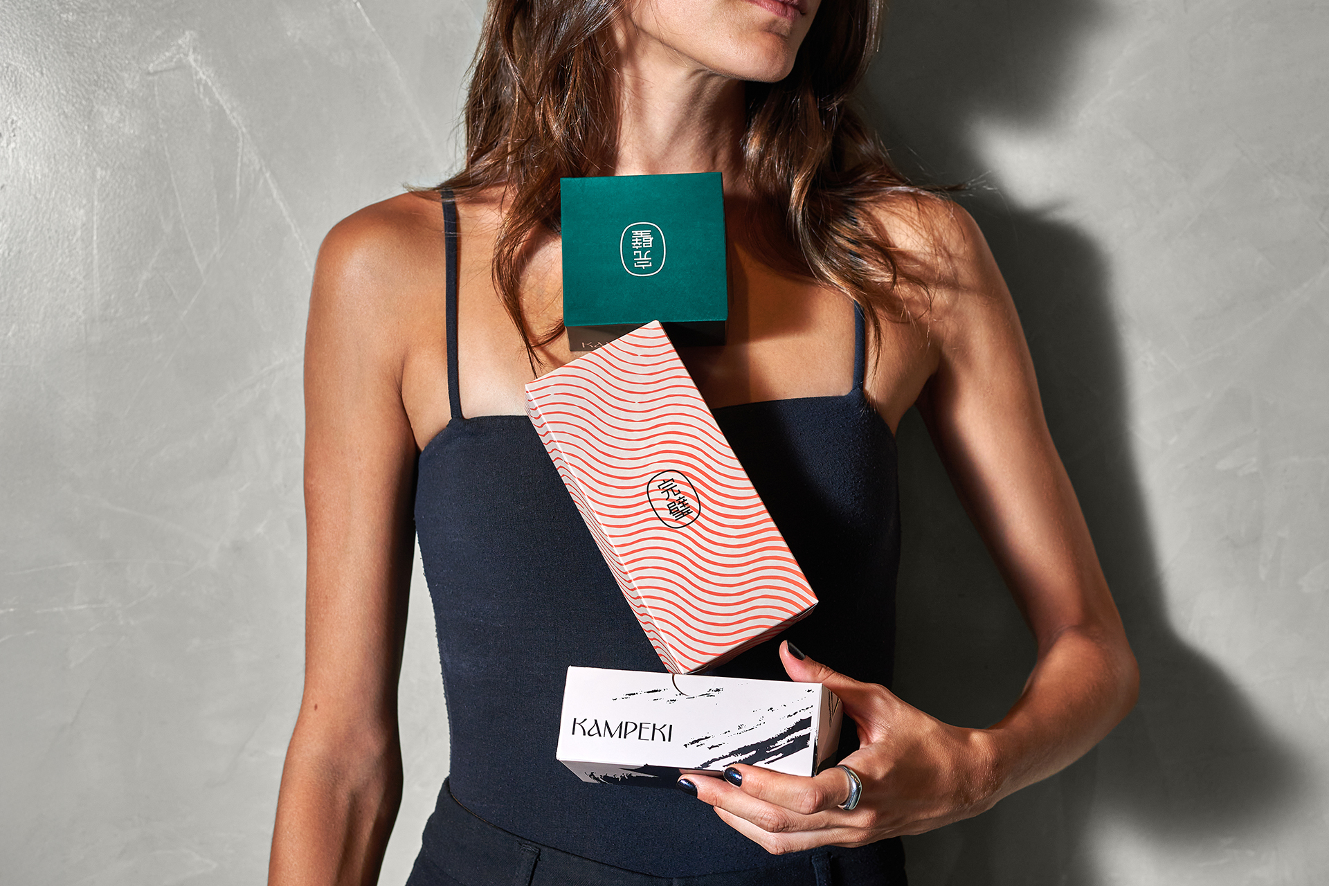
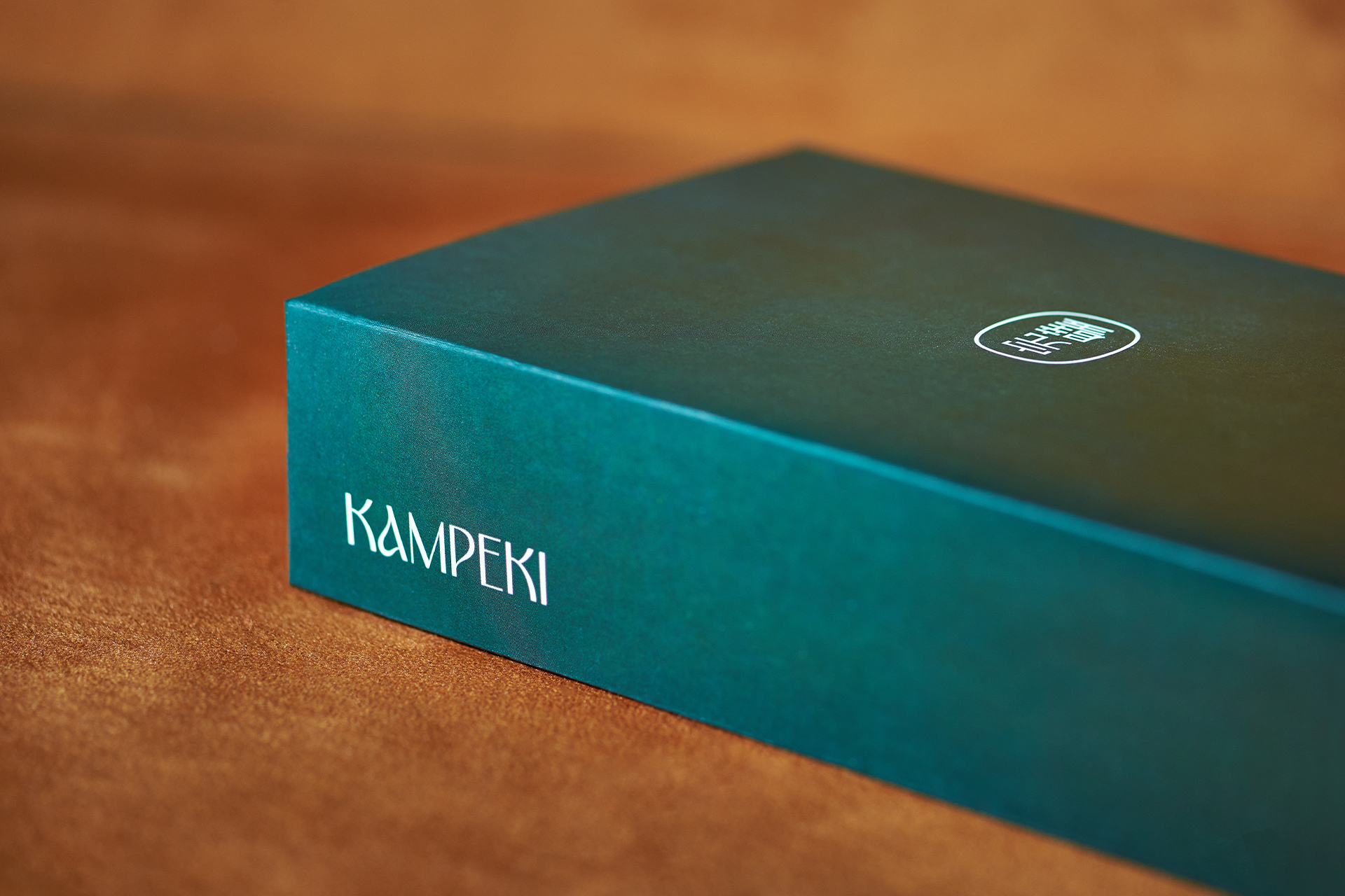
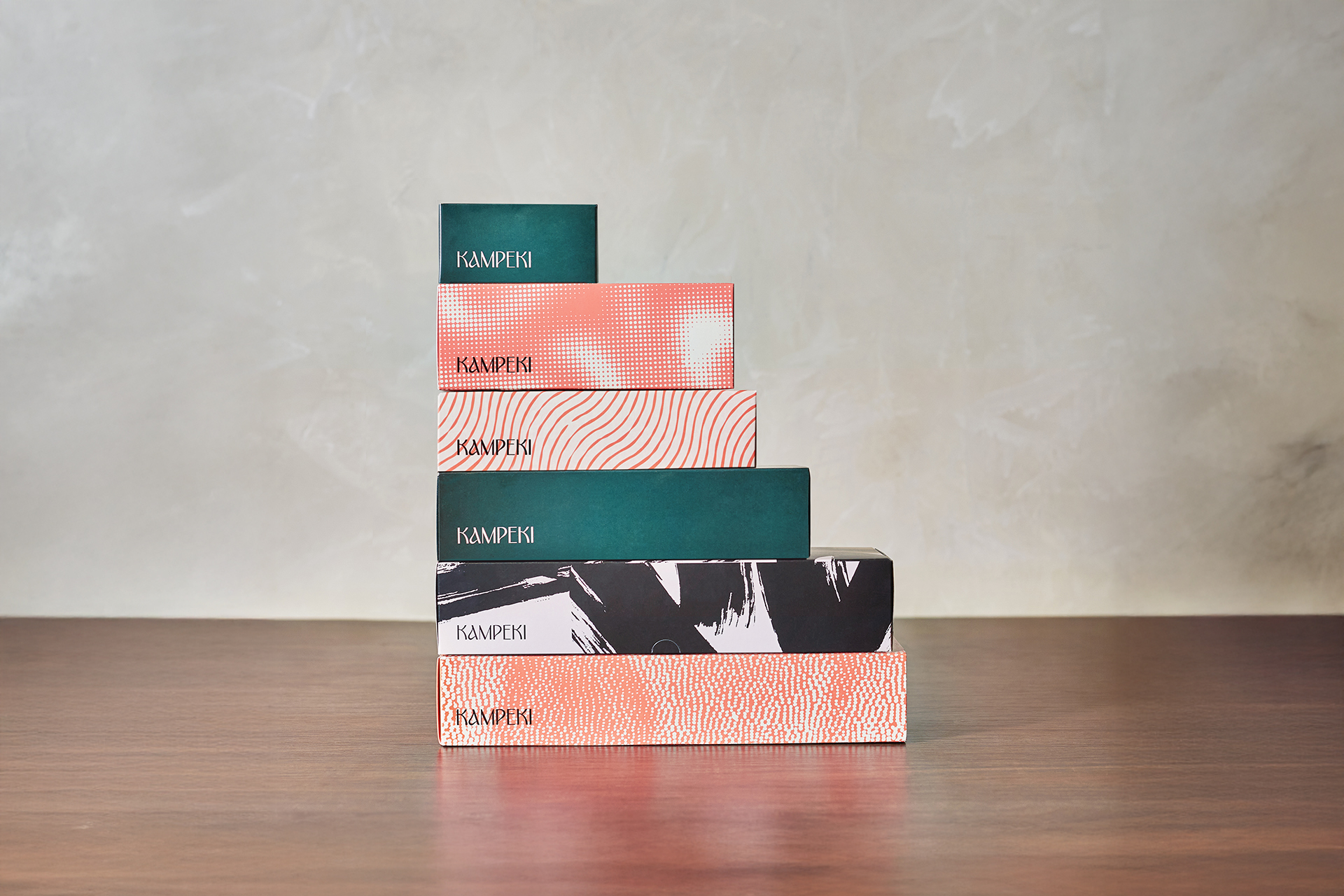
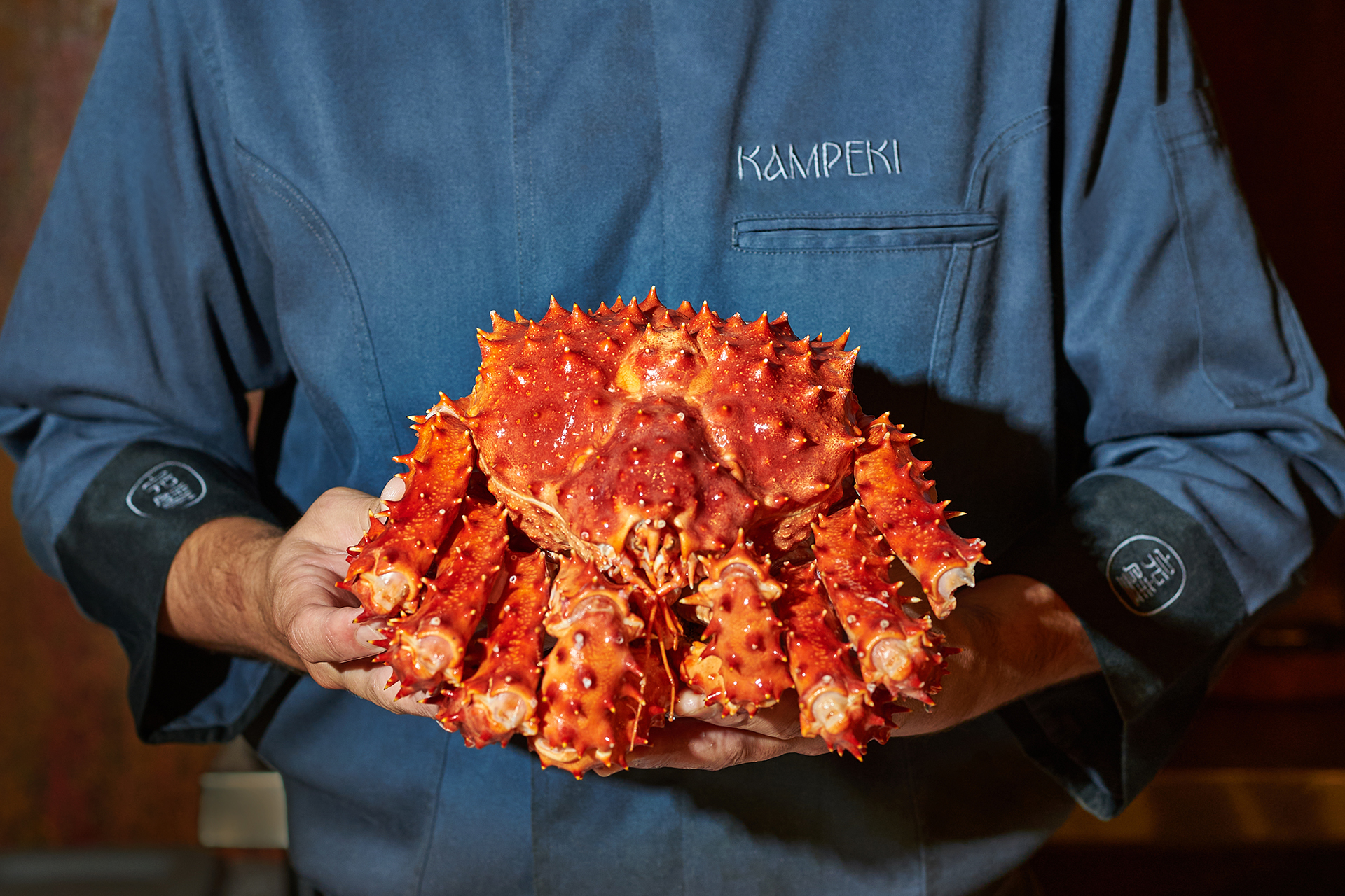
Breaking the monotony in a traditional segment. This was the restlessness that led Kampeki Sushi to rethink its identity. Sophisticated, bold, and detail-oriented, the restaurant already offered a remarkable experience. What was missing was a visual expression with the same intensity.
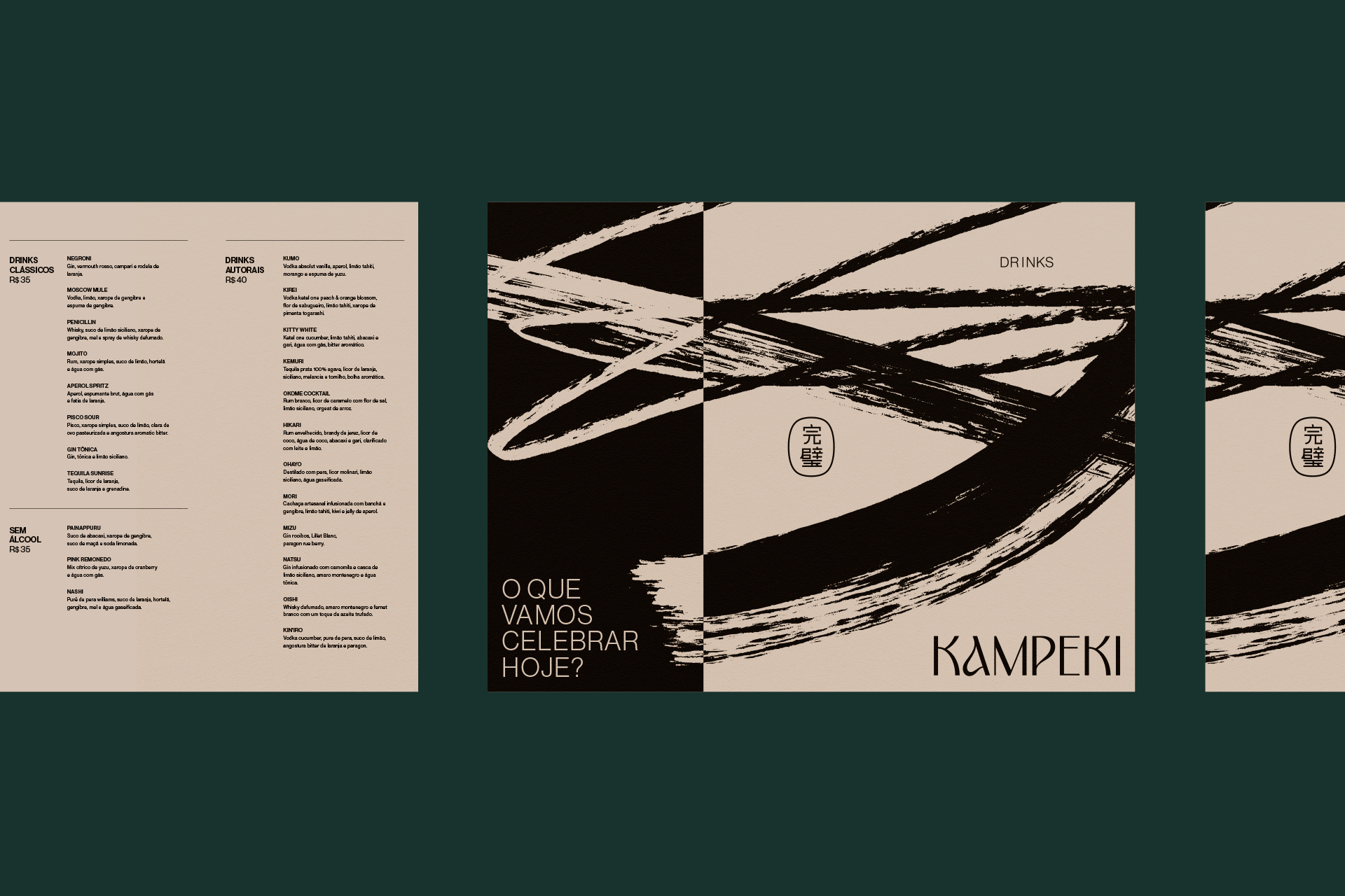
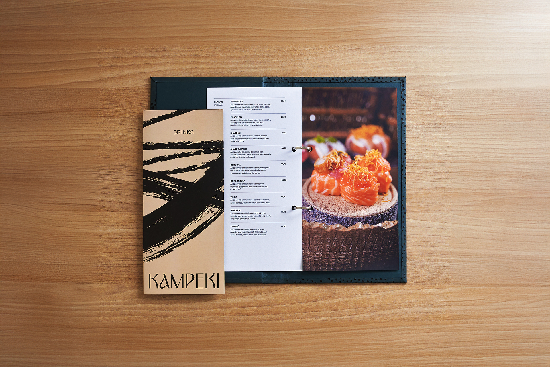
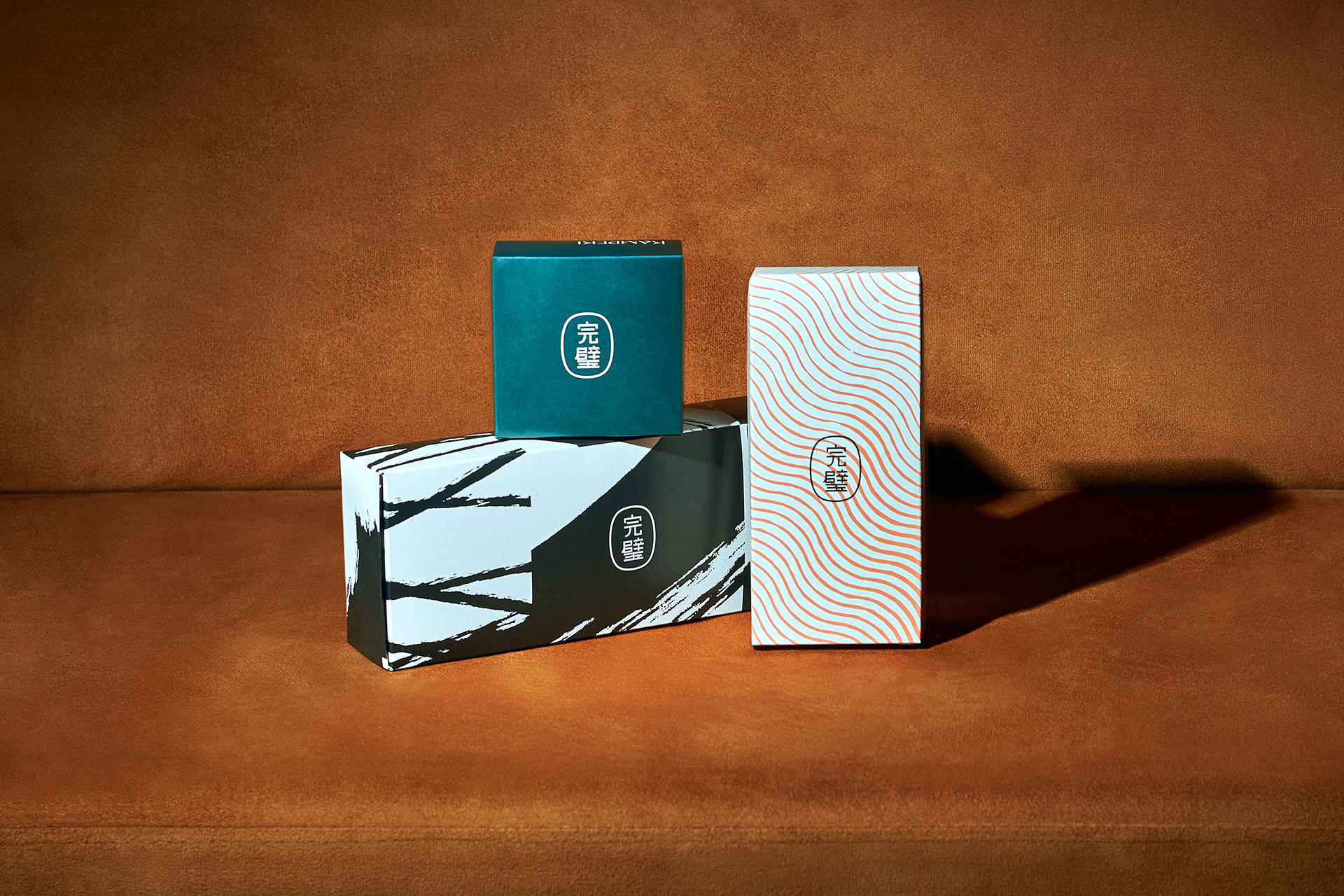
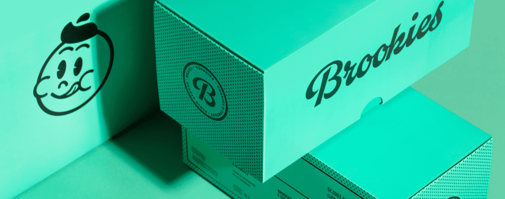
To reposition the brand and translate this vision, we created a system built around messages that complement one another, like a well-composed sequence of dishes. A primary color inspired by the symbolic simplicity of salmon set the tone for an ecosystem of packaging and textures that represent ingredients, awaken the senses, and subtly reflect Japanese aesthetics. A cohesive set that avoids repetition, guiding communication with lightness and personality. Resulting in a distinctive and memorable brand platform.